The latest batch, comprising his'n'hers birthday presents.
Saturday, 26 July 2025
Sunday, 6 July 2025
Sunday, 15 June 2025
automating money
- Launch the application
- Enter my password into the text box, and click OK.
- Select File > SaveAs... in the main application
- Enter the new file name in the Save As dialogue, and click Save
- Exit the application
from pywinauto.application import Application
def backup_ace_money(pwd,file_name):
# Launch the application
app = Application().start(r'C:\Program Files (x86)\AceMoney\AceMoney.exe', timeout=10)
# Enter password, click OK
pwd_dlg = app.window(title='Enter password')
pwd_dlg.Edit.type_keys(pwd)
pwd_dlg.OKButton.click()
# Select File > SaveAs in main window
main_dlg = app.top_window()
main_dlg.menu_select('File -> Save As...')
# Enter the file name in the Save menu, and click Save
save_dlg = app.window(title='Save As')
save_dlg.SaveAsComboBox1.type_keys(file_name)
save_dlg.SaveButton.click()
# Exit AceMoney
main_dlg.close()
The only (hah!) difficult bit was discovering the name of the box to type the file name into. (I confess that discovering the mere existence of the menu_select() function took me more time, and extreme muttering, than it should have.) The print_control_identifiers() function was indispensable for finding the name of the relevant control, but the great advantage is you can access by (relatively robust) name, not (incredibly fragile) screen position.
So, a couple of hours and 10 lines of code later, this task has now been automated.
And now I'm thinking about what to automate next.
Saturday, 22 March 2025
It's always worth checking
I was writing some Python code today, and I had some logic best served by a case statement. I remembered that Python doesn't have a case statement, but I decided to google to see if there was a suitably pythonic pattern I should use instead.
Aha! Python v3.10 introduced a case statement, and I'm currently using v3.13. Excellent. I scanned the syntax, then added the relevant lines to my code.
After I'd finished that bit of coding, I went and read the official Python tutorial. Of course, Python being Python, its 'case' statement is actually a very sophisticated and powerful 'structural pattern matching' statement. I might have some fun with this...
So, every day in every way, at least Python is getting better and better.
Saturday, 3 August 2024
Saturday, 23 March 2024
Saturday, 30 September 2023
Tuesday, 4 July 2023
Sunday, 15 January 2023
Sunday, 23 August 2020
Artificial glassware for artificial chemistries
Our new paper published recently:
Penelope Faulkner Rainford, Angelika Sebald, Susan Stepney.
MetaChem: An algebraic framework for Artificial Chemistries
Artificial Life Journal, 26(2):153–195, 2020
Abstract: We introduce MetaChem, a language for representing and implementing artificial chemistries. We motivate the need for modularization and standardization in representation of artificial chemistries. We describe a mathematical formalism for Static Graph MetaChem, a static-graph-based system. MetaChem supports different levels of description, and has a formal description; we illustrate these using StringCatChem, a toy artificial chemistry. We describe two existing artificial chemistries—Jordan Algebra AChem and Swarm Chemistry—in MetaChem, and demonstrate how they can be combined in several different configurations by using a MetaChem environmental link. MetaChem provides a route to standardization, reuse, and composition of artificial chemistries and their tools.
Artificial chemistries – computational systems that link together abstract ‘molecules’, inspired by the way natural chemistry operates – are fascinating ways to explore the growth of complexity, and underpin some aspects of Artificial Life research. Most AChem research focusses on designing the molecules and reactions of the artificial system.
Sunday, 24 May 2020
rational conics
The discussion in the book is just about circles, but a little googling helped me discover this is a result that applies more broadly.
Consider the general quadratic equation of two variables:
\(a x^2 + b x y + c y^2 + d x + e y + f = 0\)
where not all of the coefficients of the quadratic terms, \(a,b,c\), are zero. Depending on the coefficent values, this gives a circle, ellipse, parabola, or hyperbola, that is, a conic section.
Let’s now consider the restricted case where all the coefficients are rational numbers. A rational solution to this equation is a solution \((x,y)\) where both \(x\) and \(y\) are rational numbers.
Now comes the interesting bit. Take a straight line with rational slope, \(y = q x + r\), where \(q\) is rational, that cuts the quadratic curve at two points. Then either both points are rational solutions, or neither is.
The book proves this for the case of a circle, and then shows how to use the result to find all the rational points on the unit circle, \(x^2+y^2=1\). You need one point that you know is rational, so let’s chose \((-1,0)\). Then draw a straight line with rational slope that crosses the \(y\) axis at \(q\); that is, \(q\) is rational. This line has equation \(y=q(x+1)\). Then solve for the other point where the line crosses the circle to get a rational solution:
It is clear from the form of the solution that if \(q\) is rational, so is the point \((x_q,y_q)\). Additionally, there are no rational solutions that correspond to an irrational value of \(q\), so we can use \(q\) to parameterise all the rational solutions.
Notice also that if we scale up the yellow right-angled triangle, multiplying it by a suitable integer \(n\), so that both \(n x_q\) and \(n y_q\) are integers, the three sides form a Pythagorean triple.
These points and triples can be generated very easily, just by scanning through values of \(q\) and printing out the unique triples. And Python’s fraction module makes this particularly straightforward (with a bit of fiddling to print in a fixed width format to make things line up neatly; yes, I’m a bit picky about things like this):
from fractions import Fraction as frac
found = set()
for denom in range(1,15):
for num in range(1,denom):
q = frac(num,denom)
xq = (1-q*q)/(1+q*q)
yq = 2*q/(1+q*q)
n = xq.denominator
triple = sorted([int(xq*n), int(yq*n), n])
if triple[0] not in found:
print( '{0:<7} ({1:^7}, {2:^7}) {3}'.format(str(q),str(xq),str(yq),triple) )
found.add(triple[0])
This gives the output:
1/2 ( 3/5 , 4/5 ) [3, 4, 5] 2/3 ( 5/13 , 12/13 ) [5, 12, 13] 1/4 ( 15/17 , 8/17 ) [8, 15, 17] 3/4 ( 7/25 , 24/25 ) [7, 24, 25] 2/5 ( 21/29 , 20/29 ) [20, 21, 29] 4/5 ( 9/41 , 40/41 ) [9, 40, 41] 1/6 ( 35/37 , 12/37 ) [12, 35, 37] 5/6 ( 11/61 , 60/61 ) [11, 60, 61] 2/7 ( 45/53 , 28/53 ) [28, 45, 53] 4/7 ( 33/65 , 56/65 ) [33, 56, 65] 6/7 ( 13/85 , 84/85 ) [13, 84, 85] 1/8 ( 63/65 , 16/65 ) [16, 63, 65] 3/8 ( 55/73 , 48/73 ) [48, 55, 73] 5/8 ( 39/89 , 80/89 ) [39, 80, 89] 7/8 (15/113 , 112/113) [15, 112, 113] 2/9 ( 77/85 , 36/85 ) [36, 77, 85] 4/9 ( 65/97 , 72/97 ) [65, 72, 97] 8/9 (17/145 , 144/145) [17, 144, 145] 3/10 (91/109 , 60/109 ) [60, 91, 109] 7/10 (51/149 , 140/149) [51, 140, 149] 9/10 (19/181 , 180/181) [19, 180, 181] 2/11 (117/125, 44/125 ) [44, 117, 125] 4/11 (105/137, 88/137 ) [88, 105, 137] 6/11 (85/157 , 132/157) [85, 132, 157] 8/11 (57/185 , 176/185) [57, 176, 185] 10/11 (21/221 , 220/221) [21, 220, 221] 1/12 (143/145, 24/145 ) [24, 143, 145] 5/12 (119/169, 120/169) [119, 120, 169] 7/12 (95/193 , 168/193) [95, 168, 193] 11/12 (23/265 , 264/265) [23, 264, 265] 2/13 (165/173, 52/173 ) [52, 165, 173] 4/13 (153/185, 104/185) [104, 153, 185] 6/13 (133/205, 156/205) [133, 156, 205] 8/13 (105/233, 208/233) [105, 208, 233] 10/13 (69/269 , 260/269) [69, 260, 269] 12/13 (25/313 , 312/313) [25, 312, 313] 3/14 (187/205, 84/205 ) [84, 187, 205] 5/14 (171/221, 140/221) [140, 171, 221] 9/14 (115/277, 252/277) [115, 252, 277] 11/14 (75/317 , 308/317) [75, 308, 317] 13/14 (27/365 , 364/365) [27, 364, 365]and larger values are readily calculated, such as:
500/1001 (752001/1252001, 1001000/1252001) [752001, 1001000, 1252001]
So I’ve only read the Preface so far, and yet I’ve already learned some interesting stuff, and had an excuse to play with Python. Let’s hope the rest is as good (but I suspect it will rapidly get harder…)
Sunday, 17 May 2020
the Buddhabrot
The Buddhabrot takes all the points ourside the set, and plots each point in the trajectory to divergence. This leads to a density map: some points are visited more often than others (it is conventional to plot this rotated 90 degrees, to highlight the shape):
![]() |
42 million randomly chosen values of \(c\) |
Again, the code is relatively simple, and you can calculate the Buddhabrot and anti-Buddhabrot at the same time:
import numpy as np import matplotlib.pyplot as plt IMSIZE = 2048 # image width/height ITER = 1000 def mandelbrot(c, k=2): # c = position, complex; k = power, real z = c traj = [c] for i in range(1, ITER): z = z ** k + c traj += [z] if abs(z) > 2: # escapes return traj, [] return [], traj def updateimage(img, traj): for z in traj: xt, yt = z.real, z.imag ixt, iyt = int((2+xt)*IMSIZE/4), int((2-yt)*IMSIZE/4) # check traj still in plot area if 0 <= ixt and ixt < IMSIZE and 0 <= iyt and iyt < IMSIZE: img[ixt,iyt] += 1 # start with value 1 because take logs later buddha = np.ones([IMSIZE,IMSIZE]) abuddha = np.ones([IMSIZE,IMSIZE]) for i in range(IMSIZE*IMSIZE*10): z = np.complex(np.random.uniform()*4-2, np.random.uniform()*4-2) traj, traja = mandelbrot(z, k) updateimage(buddha,traj) updateimage(abuddha,traja) buddha = np.square(np.log(buddha)) # to extend small numbers abuddha = np.log(abuddha) # to extend small numbers plt.axis('off') plt.imshow(buddha, cmap='cubehelix') plt.show() plt.imshow(abuddha, cmap='cubehelix') plt.show()These plots are more are computationally expensive to produce than the plain Mandelbrot set plots: it is good to have a large number of initial points, and a long trajectory run. There are some beautifully detailed figures on the Wikipedia page.
As before, we can iterate using different powers of \(k\), and get analogues of the Buddhabrot.
![]() |
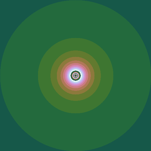
\(k = 2.5\), the "piggy-brot" |
Saturday, 16 May 2020
Julia set
Consider the sequence \(z_0=z; z_{n+1} = z_n^2 + c\), where \(z\) and \(c\) are complex numbers. Consider a given value of \(c\). Then for some values of \(z\), the sequence diverges to infinity; for other values it stays bounded. The Julia set is the border of the region(s) between which the values of \(z\) do or do not diverge. Plotting these \(z\) points in the complex plane (again plotting the points that do diverge in colours that represent how fast they diverge) gives a picture that depends on the value of \(c\):
![]() |
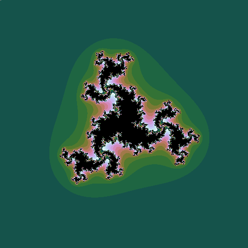
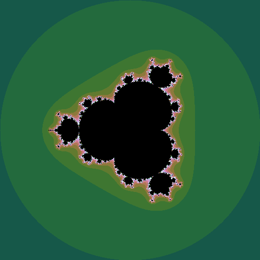
\(c = -0.5+0.5i\), a point well inside the Mandelbrot set |
![]() |
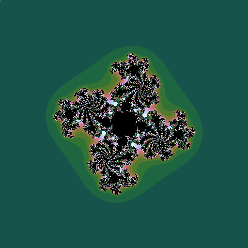
\(c = -0.5+0.6i\), a point just inside the Mandelbrot set |
![]() |
\(c = -0.5+0.7i\), a point outside the Mandelbrot set |
This leads to the idea of plotting the Mandelbrot set in a rather different way. For each value of \(c\), instead of plotting a pixel in a colur representing the speed of divergence, plot a little image of the associated Julia set, whose overall colour is related to the speed of divergence:
![]() |
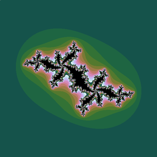
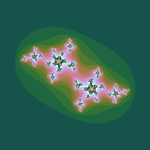
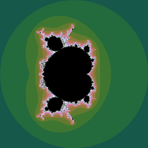
Julia sets mapping out the Mandelbrot set |
As with the Mandelbrot set, we can construct related fractals by iterating different powers, \(z_0=z; z_{n+1} = z_n^k + c\):
![]() |
\(k=3, c = -0.5+0.598i\) |
![]() |
\(k=4, c = -0.5+0.444i\) |
The code is just as simple as, and very similar to, the Mandelbrot code, too:
import numpy as np import matplotlib.pyplot as plt IMSIZE = 512 # image width/height ITER = 256 def julia(z, c, k=2): # z = position, complex ; c = constant, complex; k = power, real z = z for i in range(1, ITER): z = z ** k + c if abs(z) > 2: return 4 + i % 16 #16 colours return 0 julie = np.zeros([IMSIZE,IMSIZE]) c = np.complex(-0.5,0.5) for ix in range(IMSIZE): x = 4 * ix / IMSIZE - 2 for iy in range(IMSIZE): y = 2 - 4 * iy / IMSIZE julie[iy,ix] = julia(np.complex(x,y), c, 5) julie[0,0]=0 # kludge to get uniform colour maps for all plots plt.axis('off') plt.imshow(julie, cmap='cubehelix') plt.show()
Thursday, 14 May 2020
Mandelbrot set
The Mandelborot set is a highly complex fractal generated from a very simple equation. Consider the sequence \(z_0=0; z_{n+1} = z_n^2 + c\), where \(z\) and \(c\) are complex numbers. For some values of \(c\), the sequence diverges to infinity; for other values it stays bounded. The Mandelbrot set is all the values of \(c\) for which the sequence does not diverge. Plotting these points in the complex plane (and plotting the points that do diverge in colours that represent how fast they diverge) gives the now well-known picture:
If \(z\) is raised to a different power, different sets are seen, still with complex shapes.
![]() |
iterating \(z^4 + c\) |
![]() |
iterating \(z^{2.5} + c\) |
We can make an animation of the shape of the set as this power \(k\) changes:
![]() |
\(k = 1 .. 6\), step \(0.05\) |
One thing I love about the Mandelbrot set is the sheer simplicity of the code needed to plot it:
import numpy as np import matplotlib.pyplot as plt IMSIZE = 512 # image width/height ITER = 256 def mandelbrot(c, k=2): # c = position, complex; # k = power, real z = c for i in range(1, ITER): if abs(z) > 2: return 4 + i % 16 #16 colours z = z ** k + c return 0 mandy = np.zeros([IMSIZE,IMSIZE]) for ix in range(IMSIZE): x = 4 * ix / IMSIZE - 2 for iy in range(IMSIZE): y = 2 - 4 * iy / IMSIZE mandy[iy,ix] = mandelbrot(np.complex(x,y), k) plt.axis('off') plt.imshow(mandy, cmap='cubehelix') plt.show()And there's more. But that's for another post.
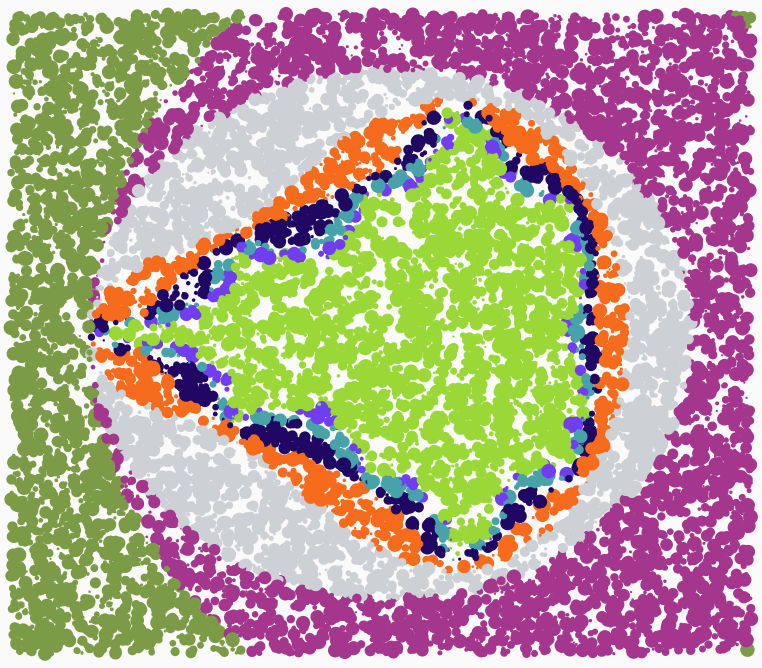
Saturday, 2 May 2020
book review: Generative Design
Generative Design: visualize, program, and create with Processing.
Princeton Architectural Press. 2012
Having read Pearson’s introduction to Generative Art with Processing I was in the mood to move on to the next level. Hence this book, also based on the interactive Processing language, but with many more, and more sophisticated, projects. These cover bothart and design.
The book is in three main parts. First, Project Selection, is over 100 pages of glossy pictures, whetting the appetite for what is to come. Second, we get Basic Principles, starting with an introduction to Processing, and chapters on working with colour, shape, text and images; these projects are quite sophisticated in their own right, but each focusses on a single aspect. Finally, we get Complex Methods: more ambitious projects combining the concepts introduced earlier.
All the code is available online (in Java mode), which provides an incredibly rich resource to start working from. I didn’t directly use any of this code; I did, however, get inspiration from the Sunburst Trees project to write some of my own (Python) code to draw basins of attraction of elementary cellular automata:

A lovely book all round: great content, and beautifully typeset.
For all my book reviews, see my main website.
Monday, 27 April 2020
book review: Generative Art
Generative Art.
Manning. 2011
This is an introduction to producing generative art using the Processing language. I had a brief fiddle around with Processing a while ago, and produced a little app for playing around with the superformula; I read this book to see how Processing is used for art. Processing was invented to be an “easy” language for artists to learn. In its original form, it is based on a stripped down version of Java. I discovered with a bit of Googling that there is also a Python Mode available, which I find preferable.
The book has an introduction to generative art, and introduction to Processing (Java Mode), and three example sections on its use for art: emergent swarming behaviour, cellular automata, and fractals. There are lots of good examples to copy and modify, and also lots of pictures of somewhat more sophisticated examples of generative art.
There is a lot of emphasis on adding noise and randomness to break away from perfection: [p51] There is a certain joylessness in perfect accuracy. Now, fractals are one area that can provide exquisite detail, but are they too accurate? I decided to take his advice, and add some randomness to the well-known Mandelbrot set: instead of a regular grid, I sampled the space at random, and plotted a random-sized dot of the appropriate colour:
It certainly has a different feel from the classic Mandelbrot set picture, but I’m not going to claim it as art. However, the Python Mode Processing code is certainly brief:
def setup(): size(1200, 800) noStroke() background(250) def draw(): cre,cim = random(-2.4,1.3),random(-1.6,1.6) x,y = 0,0 n = 0 while x*x + y*y < 4 and n < 8 : n += 1 x,y = x*x - y*y + cre, 2*x*y + cim fill((n+2)*41 %256, (256-n*101) % 256, n*71 %256) r = random(2,15) circle(cre*height/4+width/2,cim*height/4+height/2,r)
Note for publishers: don’t typeset your books in a minuscule typeface, grey text on white, with paper so thin that the text shows through, if you want anyone over the age of 25 to read it comfortably. I frankly skimmed in places. Nevertheless, this book should provide a good introduction to Processing for artists, providing basic skill that can then be incrementally upgraded as time goes by.
Sunday, 16 February 2020
sequestering carbon, several books at a time CIII
Saturday, 22 June 2019
Friday, 22 February 2019
Friday, 27 July 2018
a student of the t-test
- you have some (possibly conceptual) population \(P\) of individuals, from which you can take a sample
- there is some statistic \(S\) of interest for your problem (the mean, the standard deviation, ...)
- you have a null hypothesis that your population \(P\) has the same value of the statistic as some reference population (for example, null hypothesis: the mean size of my treated population is the same as the mean size of the untreated population)
- the statistic \(S\) will have as a corresponding sampling distribution \(X\)
- this is the distribution of the original statistic \(S\) if you measure it over many samples (for example, if you measure the mean of a sample, some samples will have a low mean – you were unlucky enough to pick all small members, sometimes a high mean – you just happened to pick all large members, but mostly a mean close to the true population mean)
- if you assume the population has some specific distribution (eg a normal distribution), you can often calculate this distribution \(X\)
- when you look at your actual experimental sample, you see where it lies within in this sampling distribution
- the sampling distribution \(X\) has some critical value, \(x_{crit}\), dependent on your desired significance \(\alpha\); only a small proportion of the distribution lies beyond \(x_{crit}\)
- your experimental sample has a value of the statistic \(S\), let’s call it \(x_{obs}\); if \(x_{obs} > x_{crit}\), it lies in that very small proportion of the distribution; this is deemed to be sufficiently unlikely to have happened by chance, and it is more likely that the null hypothesis doesn’t hold; so you reject the null hypothesis at the \(1-\alpha\) confidence level
This is all a bit abstract, so let’s look in detail how it works for the Student’s \(t\)-test. (This test was invented by the statistician William Sealy Gossett, who published under the pseudonym Student, hence the name.) One of the nice things about having access to a programming language is that we can look at actual samples and distributions, to get a clearer intuition of what is going on. I’ve used Python to draw all the charts below.
Let’s assume we have the following conceptual setup. We have a population of items, with a population mean \(\mu\) and population variance \(\sigma^2\). From this we draw a sample of n items. We calculate a statistic of that sample (for example, the sample mean \(\bar{x}\) or the sample variance \(s^2\)). We then draw another sample (either assuming we are drawing ‘with replacement’, or assuming that the population is large enough that this doesn’t matter), and calculate its relevant statistic. We do the \(r\) times, so we have \(r\) values of the statistic, giving us a distribution of that statistic, which we show in a histogram. Here is the process for a population (of circles) with a uniform distribution of sizes (radius of the circles) between 0 and 300, and hence a mean size of 150.
Even with 3000 samples, that histogram looks a bit ragged. Mathematically, the distribution we want is the one we get in the limit as the number of samples tends to infinity. But here we are programming, so we want a number of samples that is ‘big enough’.
The chart below uses a population with a standard normal distribution (mean zero, standard deviation 1), and shows the sampling distribution that results from calculating the mean of the samples. We can see that by the time we have 100,000 samples, the histogram is pretty smooth.
So in what follows, we use 100,000 samples in order to get a good view of the underlying distribution. An the population will always be a normal distribution.
In the above example, there were 10 items per sample. How does the size of the sample (that is, the number of items in each sample, not the number of different samples) affect the distribution?
The chart below takes 100,000 samples of different sizes (3, 5, 10, 20), and shows the sampling distributions of (top) the means and (middle) the standard deviations of those samples. The bottom chart is a scatter plot of the (mean, sd) for each sample.
So we can see a clear effect on the size of samples drawn from the normal distribution
- for larger samples, the sample means are more closely distributed around the population mean (of 0) – larger samples give a better estimate of the underlying population mean
- for larger samples, the sample standard deviations are more closely and more symmetrically distributed around the population std dev (of 1) – larger samples give a better estimate of the underlying population s.d.
$$ t = \frac{\bar{x}-\mu}{s / \sqrt{n}}$$ The chart below shows how the distribution of the \(t\)-statistic varies with sample size.
In the limit that the number of samples tends to infinity, and where the underlying population has a normal distribution with a mean of \(\mu\), then this is the ‘\(t\)-distribution with \(n-1\) degrees of freedom’. Overlaying the plots above with the \(t\)-distribution shows a good fit.
The \(t\)-distribution does depend on the sample size, but not as extremely as the distribution of means:
Note that the underlying distribution being sampled is normal with a mean of \(\mu\), but the sd is not specified. To check whether this is important, the chart below shows the sampling distribution with a sample size of 10, from normal distributions with a variety of sds:
But what if we have the population mean wrong? That is, what if we assume that our samples are drawn from a population with a mean of \(\mu\) (the \(\mu\) used in the \(t\)-statistic), but it is actually drawn from a population with a different mean? The chart below shows the experimental sampling distribution, compared to the theoretical \(t\)-distribution:
So, if the underlying distribution is normal with the assumed mean, we get a good match, and if it isn’t, we don’t. This is the basis of the \(t\)-test.
- First, define \(t_{crit}\) to be the value for \(t\) such that the area under the sampling distribution curve outside \(t_{crit}\) is \(\alpha\) (\(\alpha\) is typically 0.05, or 0.01).
- Calculate \(t_{obs}\) of your sample. The probability of it falling outside \(t_{crit}\) if the null hypothesis holds is \(\alpha\), a small value. The test says if this happens, it is more likely that the null hypothesis does not hold than you were unlucky, so reject the null hypothesis (with confidence \(1-\alpha\), 95% or 99% in the cases above).
- There are four cases, illustrated in the chart below for three different sample sizes:
- Your population has a normal distribution with mean \(\mu\)
- The \(t\)-statistic of your sample falls inside \(t_{crit}\) (with high probability \(1-\alpha\)). You correctly fail to reject the null hypothesis: a true negative.
- The \(t\)-statistic of your sample falls outside \(t_{crit}\) (with low probability \(\alpha\)). You incorrectly reject the null hypothesis: a false positive.
- Your population has a normal distribution, but with a mean different from \(\mu\)
- The \(t\)-statistic of your sample falls inside \(t_{crit}\). You incorrectly fail to reject the null hypothesis: a false negative.
- The \(t\)-statistic of your sample falls outside \(t_{crit}\). You correctly reject the null hypothesis: a true positive.
Note that there is a large proportion of false negatives (red areas in the chart above). You may have only a small change of incorrectly rejecting the null hypothesis when it holds (high confidence), but may still have a large chance of incorrectly failing to reject it when it is false (low statistical power). You can reduce this second error by increasing your sample size, as shown in the chart below (notice how the red area reduces as the sample size increases).
So that is the detail for the \(t\)-test assuming a normal distribution, but the same underlying philosophy holds for other tests and other distributions: a given observation is unlikely if the null hypothesis holds, assuming some properties of the sampling distribution (here that it is normal), so reject the null hypothesis with high confidence.
But what about the \(t\)-test if the sample is drawn from a non-normal distribution? Well, it doesn’t work, because the calculation of \(t_{crit}\) is derived from the \(t\)-distribution, which assumes an underlying a normal population distribution.